本节代码对应 GitHub 分支: chapter6
现在就进入到具体组件的开发了,首先是静态的布局部分。
# 顶部和菜单布局
//Album/index.js
import React, {useState} from 'react';
import {Container} from './style';
import { CSSTransition } from 'react-transition-group';
import  Header  from './../../baseUI/header/index';
import Scroll from '../../baseUI/scroll/index';

function Album (props) {
  const [showStatus, setShowStatus] = useState (true);

  //mock 数据
  const currentAlbum = {
    creator: {
      avatarUrl: "http://p1.music.126.net/O9zV6jeawR43pfiK2JaVSw==/109951164232128905.jpg",
      nickname: "浪里推舟"
    },
    coverImgUrl: "http://p2.music.126.net/ecpXnH13-0QWpWQmqlR0gw==/109951164354856816.jpg",
    subscribedCount: 2010711,
    name: "听完就睡,耳机是天黑以后柔软的梦境",
    tracks:[
      {
        name: "我真的受伤了",
        ar: [{name: "张学友"}, {name: "周华健"}],
        al: {
          name: "学友 热"
        }
      },
      {
        name: "我真的受伤了",
        ar: [{name: "张学友"}, {name: "周华健"}],
        al: {
          name: "学友 热"
        }
      },
      {
        name: "我真的受伤了",
        ar: [{name: "张学友"}, {name: "周华健"}],
        al: {
          name: "学友 热"
        }
      },
      {
        name: "我真的受伤了",
        ar: [{name: "张学友"}, {name: "周华健"}],
        al: {
          name: "学友 热"
        }
      },
      {
        name: "我真的受伤了",
        ar: [{name: "张学友"}, {name: "周华健"}],
        al: {
          name: "学友 热"
        }
      },
      {
        name: "我真的受伤了",
        ar: [{name: "张学友"}, {name: "周华健"}],
        al: {
          name: "学友 热"
        }
      },
      {
        name: "我真的受伤了",
        ar: [{name: "张学友"}, {name: "周华健"}],
        al: {
          name: "学友 热"
        }
      },
      {
        name: "我真的受伤了",
        ar: [{name: "张学友"}, {name: "周华健"}],
        al: {
          name: "学友 热"
        }
      },
      {
        name: "我真的受伤了",
        ar: [{name: "张学友"}, {name: "周华健"}],
        al: {
          name: "学友 热"
        }
      },
      {
        name: "我真的受伤了",
        ar: [{name: "张学友"}, {name: "周华健"}],
        al: {
          name: "学友 热"
        }
      },
    ]
  }

  const handleBack = () => {
    setShowStatus (false);
  };

  return (
    <CSSTransition
      in={showStatus}
      timeout={300}
      classNames="fly"
      appear={true}
      unmountOnExit
      onExited={props.history.goBack}
    >
      <Container>
        <Header title={"返回"} handleClick={handleBack}></Header>
        // 这里是具体布局 JSX 代码
      </Container>
    </CSSTransition>
  )
}

export default React.memo (Album);
接下来我们来开始具体布局的 JSX 代码,
<Scroll bounceTop={false}>
<div>
<TopDesc background={currentAlbum.coverImgUrl}>
<div className="background">
<div className="filter"></div>
</div>
<div className="img_wrapper">
<div className="decorate"></div>
<img src={currentAlbum.coverImgUrl} alt=""/>
<div className="play_count">
<i className="iconfont play"></i>
<span className="count">{Math.floor (currentAlbum.subscribedCount/1000)/10} 万 </span>
</div>
</div>
<div className="desc_wrapper">
<div className="title">{currentAlbum.name}</div>
<div className="person">
<div className="avatar">
<img src={currentAlbum.creator.avatarUrl} alt=""/>
</div>
<div className="name">{currentAlbum.creator.nickname}</div>
</div>
</div>
</TopDesc>
<Menu>
<div>
<i className="iconfont"></i>
评论
</div>
<div>
<i className="iconfont"></i>
点赞
</div>
<div>
<i className="iconfont"></i>
收藏
</div>
<div>
<i className="iconfont"></i>
更多
</div>
</Menu>
</div>
</Scroll>
// 对应 style.js
// 添加 TopDesc 和 Menu
export const TopDesc = styled.div`
background-size: 100%;
padding: 5px 20px;
padding-bottom: 50px;
margin-bottom: 20px;
display: flex;
justify-content: space-around;
align-items: center;
box-sizing: border-box;
width: 100%;
height: 275px;
position: relative;
.background {
z-index: -1;
background: url (${props => props.background}) no-repeat;
background-position: 0 0;
background-size: 100% 100%;
position: absolute;
width: 100%;
height: 100%;
filter: blur (20px);
.filter {
position: absolute;
z-index: 10;
top: 0; left: 0;
width: 100%;
height: 100%;
background: rgba (7, 17, 27, 0.2);
}
}
.img_wrapper {
width: 120px;
height: 120px;
position: relative;
.decorate {
position: absolute;
top: 0;
width: 100%;
height: 35px;
border-radius: 3px;
background: linear-gradient (hsla (0,0%,43%,.4),hsla (0,0%,100%,0));
}
.play_count {
position: absolute;
right: 2px;
top: 2px;
font-size: ${style ["font-size-s"]};
line-height: 15px;
color: ${style ["font-color-light"]};
.play {
vertical-align: top;
}
}
img {
width: 120px;
height: 120px;
border-radius:3px;
}
}
.desc_wrapper {
flex: 1;
display: flex;
flex-direction: column;
justify-content: space-around;
height: 120px;
padding: 0 10px;
.title {
max-height: 70px;
color: ${style ["font-color-light"]};
font-weight: 700;
line-height: 1.5;
font-size: ${style ["font-size-l"]};
}
.person {
display: flex;
.avatar {
width: 20px;
height: 20px;
margin-right: 5px;
img {
width: 100%;
height: 100%;
border-radius: 50%;
}
}
.name {
line-height: 20px;
font-size: ${style ["font-size-m"]};
color: ${style ["font-color-desc-v2"]};
}
}
}
`;
export const Menu = styled.div`
position: relative;
display: flex;
justify-content: space-between;
box-sizing: border-box;
padding: 0 30px 20px 30px;
margin: -100px 0 0 0;
>div {
display: flex;
flex-direction: column;
line-height: 20px;
text-align: center;
font-size: ${style ["font-size-s"]};
color: ${style ["font-color-light"]};
z-index:1000;
font-weight: 500;
.iconfont {
font-size: 20px;
}
}
`;
对应的样式组件自行引入组件代码中,这里相信你已经很娴熟了。
# 歌单列表布局
现在我们紧接着来添加歌单列表。
// 紧接着 TopDesc 和 Menu
<SongList>
<div className="first_line">
<div className="play_all">
<i className="iconfont"></i>
<span > 播放全部 <span className="sum">(共 {currentAlbum.tracks.length} 首)</span></span>
</div>
<div className="add_list">
<i className="iconfont"></i>
<span > 收藏 ({getCount (currentAlbum.subscribedCount)})</span>
</div>
</div>
<SongItem>
{
currentAlbum.tracks.map ((item, index) => {
return (
<li key={index}>
<span className="index">{index + 1}</span>
<div className="info">
<span>{item.name}</span>
<span>
{ getName (item.ar) } - { item.al.name }
</span>
</div>
</li>
)
})
}
</SongItem>
</SongList>
其中 getName 是一个工具方法,我们在 api/utils.js 里面来写一下:
// 处理歌手列表拼接歌手名字
export const getName = list => {
  let str = "";
  list.map ((item, index) => {
    str += index === 0 ? item.name : "/" + item.name;
    return item;
  });
  return str;
};
在 Album 组件代码中引入,
import { getName } from './../../api/utils';
然后开始编写歌单的样式组件:
//style.js 中加入
export const SongList = styled.div`
  border-radius: 10px;
  opacity: 0.98;
  ${props => props.showBackground ? `background: ${style ["highlight-background-color"]}`: ""}
  .first_line {
    box-sizing: border-box;
    padding: 10px 0;
    margin-left: 10px;
    position: relative;
    justify-content: space-between;
    border-bottom: 1px solid ${style ["border-color"]};
    .play_all {
      display: inline-block;
      line-height: 24px;
      color: ${style ["font-color-desc"]};
      .iconfont {
        font-size: 24px;
        margin-right: 10px;
        vertical-align: top;
      }
      .sum {
        font-size: ${style ["font-size-s"]};
        color: ${style ["font-color-desc-v2"]};
      }
      >span {
        vertical-align: top;
      }
    }
    .add_list,.isCollected {
      display: flex;
      align-items: center;
      position: absolute;
      right: 0; top :0; bottom: 0;
      width: 130px;
      line-height: 34px;
      background: ${style ["theme-color"]};
      color: ${style ["font-color-light"]};
      font-size: 0;
      border-radius: 3px;
      vertical-align: top;
      .iconfont {
        vertical-align: top;
        font-size: 10px;
        margin: 0 5px 0 10px;
      }
      span {
        font-size: 14px;
        line-height: 34px;
      }
    }
    .isCollected {
      display: flex;
      background: ${style ["background-color"]};
      color: ${style ["font-color-desc"]};
    }
}
`
export const SongItem = styled.ul`
  >li {
    display: flex;
    height: 60px;
    align-items: center;
    .index {
      flex-basis: 60px;
      width: 60px;
      height: 60px;
      line-height: 60px;
      text-align: center;
    }
    .info {
      box-sizing: border-box;
      flex: 1;
      display: flex;
      height: 100%;
      padding: 5px 0;
      flex-direction: column;
      justify-content: space-around;
      border-bottom: 1px solid ${style ["border-color"]};
      ${style.noWrap ()}
      >span {
        ${style.noWrap ()}
      }
      >span:first-child {
        color: ${style ["font-color-desc"]};
      }
      >span:last-child {
        font-size: ${style ["font-size-s"]};
        color: #bba8a8;
      }
    }
  }
`
接下来把样式组件引入到 Album/index.js 中,大家自行完成。
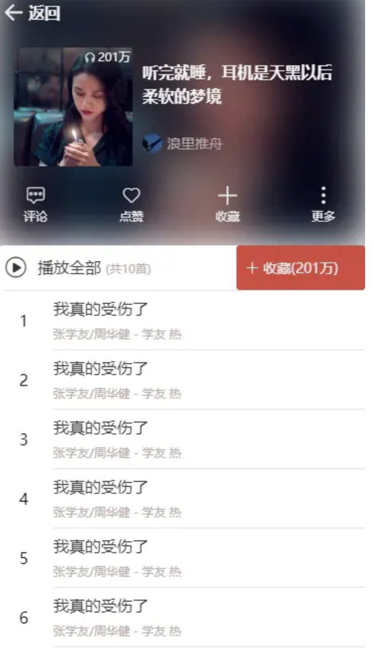
现在初步的布局效果就有了,让大家瞧一瞧。
# 滑动时 Header 联动效果
作为一个精美的 WebApp,我们当然不仅仅是考虑静态布局啦,滑动时的体验也要兼顾,大家去项目预览地址可以看到,在滑动的过程中 Header 组件的背景会逐渐变红,而且里面的文字换成了歌单名,并且呈现出一个跑马灯的效果。

现在又体现出了封装 Scroll 基础组件的优势了,在 Scroll 组件中,初始化时已经监听了滚动事件并且自动执行回调,因此我们直接编写回调逻辑即可。
首先我们稍微改造一下 Header 组件。
const Header = React.forwardRef ((props, ref) => {
const { handleClick, title, isMarquee} = props;
return (
<HeaderContainer ref={ref}>
<i className="iconfont back" onClick={handleClick}></i>
{
isMarquee ? <marquee><h1>{title}</h1></marquee>:
<h1>{title}</h1>
}
</HeaderContainer>
)
})
Header.defaultProps = {
//...
isMarquee: false
};
Header.propTypes = {
//...
isMarquee: PropTypes.bool
};
接下来,在 Album 组件中,加入:
import React, { useState, useCallback, useRef } from 'react';

const [title, setTitle] = useState ("歌单");
const [isMarquee, setIsMarquee] = useState (false);// 是否跑马灯

const headerEl = useRef ();
// 传参修改如下:
<Header ref={headerEl} title={title} handleClick={handleBack} isMarquee={isMarquee}></Header>
接着可以加入滑动处理逻辑了:
// 首先引入
import style from "../../assets/global-style";

export const HEADER_HEIGHT = 45;

const handleScroll = (pos) => {
  let minScrollY = -HEADER_HEIGHT;
  let percent = Math.abs (pos.y/minScrollY);
  let headerDom = headerEl.current;
  // 滑过顶部的高度开始变化
  if (pos.y < minScrollY) {
    headerDom.style.backgroundColor = style ["theme-color"];
    headerDom.style.opacity = Math.min (1, (percent-1)/2);
    setTitle (currentAlbum.name);
    setIsMarquee (true);
  } else {
    headerDom.style.backgroundColor = "";
    headerDom.style.opacity = 1;
    setTitle ("歌单");
    setIsMarquee (false);
  }
};

// 传递给 Scroll 组件
<Scroll bounceTop={false} onScroll={handleScroll}></Scroll>
OK, 现在静态页面的布局就已经基本完成了。接下来进入数据层的对接,大家加油!
阅读全文


