# 分类
在讲解选择器的奇妙用处前,还是先把选择器分类记忆吧。没错,笔者就是喜欢总结。由于选择器的标准概念上无作出明确的分类,以下的分类是为了方便记忆而整理的。
基础选择器
| 选择器 | 别名 | 说明 | 版本 |
|---|---|---|---|
tag | 标签选择器 | 指定类型的标签 | 1 |
#id | ID选择器 | 指定身份的标签 | 1 |
.class | 类选择器 | 指定类名的标签 | 1 |
* | 通配选择器 | 所有类型的标签 | 2 |
层次选择器
| 选择器 | 别名 | 说明 | 版本 |
|---|---|---|---|
elemP elemC | 后代选择器 | 元素的后代元素 | 1 |
elemP>elemC | 子代选择器 | 元素的子代元素 | 2 |
elem1+elem2 | 相邻同胞选择器 | 元素相邻的同胞元素 | 2 |
elem1~elem2 | 通用同胞选择器 | 元素后面的同胞元素 | 3 |
集合选择器
| 选择器 | 别名 | 说明 | 版本 |
|---|---|---|---|
elem1,elem2 | 并集选择器 | 多个指定的元素 | 1 |
elem.class | 交集选择器 | 指定类名的元素 | 1 |
条件选择器
| 选择器 | 说明 | 版本 |
|---|---|---|
:lang | 指定标记语言的元素 | 2 |
:dir() | 指定编写方向的元素 | 4 |
:has | 包含指定元素的元素 | 4 |
:is | 指定条件的元素 | 4 |
:not | 非指定条件的元素 | 4 |
:where | 指定条件的元素 | 4 |
:scope | 指定元素作为参考点 | 4 |
:any-link | 所有包含href的链接元素 | 4 |
:local-link | 所有包含href且属于绝对地址的链接元素 | 4 |
行为选择器
| 选择器 | 说明 | 版本 |
|---|---|---|
:active | 鼠标激活的元素 | 1 |
:hover | 鼠标悬浮的元素 | 1 |
::selection | 鼠标选中的元素 | 3 |
状态选择器
| 选择器 | 说明 | 版本 |
|---|---|---|
:target | 当前锚点的元素 | 3 |
:link | 未访问的链接元素 | 1 |
:visited | 已访问的链接元素 | 1 |
:focus | 输入聚焦的表单元素 | 2 |
:required | 输入必填的表单元素 | 3 |
:valid | 输入合法的表单元素 | 3 |
:invalid | 输入非法的表单元素 | 3 |
:in-range | 输入范围以内的表单元素 | 3 |
:out-of-range | 输入范围以外的表单元素 | 3 |
:checked | 选项选中的表单元素 | 3 |
:optional | 选项可选的表单元素 | 3 |
:enabled | 事件启用的表单元素 | 3 |
:disabled | 事件禁用的表单元素 | 3 |
:read-only | 只读的表单元素 | 3 |
:read-write | 可读可写的表单元素 | 3 |
:target-within | 内部锚点元素处于激活状态的元素 | 4 |
:focus-within | 内部表单元素处于聚焦状态的元素 | 4 |
:focus-visible | 输入聚焦的表单元素 | 4 |
:blank | 输入为空的表单元素 | 4 |
:user-invalid | 输入合法的表单元素 | 4 |
:indeterminate | 选项未定的表单元素 | 4 |
:placeholder-shown | 占位显示的表单元素 | 4 |
:current() | 浏览中的元素 | 4 |
:past() | 已浏览的元素 | 4 |
:future() | 未浏览的元素 | 4 |
:playing | 开始播放的媒体元素 | 4 |
:paused | 暂停播放的媒体元素 | 4 |
结构选择器
| 选择器 | 说明 | 版本 |
|---|---|---|
:root | 文档的根元素 | 3 |
:empty | 无子元素的元素 | 3 |
:first-letter | 元素的首字母 | 1 |
:first-line | 元素的首行 | 1 |
:nth-child(n) | 元素中指定顺序索引的元素 | 3 |
:nth-last-child(n) | 元素中指定逆序索引的元素 | 3 |
:first-child | 元素中为首的元素 | 2 |
:last-child | 元素中为尾的元素 | 3 |
:only-child | 父元素仅有该元素的元素 | 3 |
:nth-of-type(n) | 标签中指定顺序索引的标签 | 3 |
:nth-last-of-type(n) | 标签中指定逆序索引的标签 | 3 |
:first-of-type | 标签中为首的标签 | 3 |
:last-of-type | 标签中为尾标签 | 3 |
:only-of-type | 父元素仅有该标签的标签 | 3 |
属性选择器
| 选择器 | 说明 | 版本 |
|---|---|---|
[attr] | 指定属性的元素 | 2 |
[attr=val] | 属性等于指定值的元素 | 2 |
[attr*=val] | 属性包含指定值的元素 | 3 |
[attr^=val] | 属性以指定值开头的元素 | 3 |
[attr$=val] | 属性以指定值结尾的元素 | 3 |
[attr~=val] | 属性包含指定值(完整单词)的元素(不推荐使用) | 2 |
[attr|=val] | 属性以指定值(完整单词)开头的元素(不推荐使用) | 2 |
伪元素
| 选择器 | 说明 | 版本 |
|---|---|---|
::before | 在元素前插入的内容 | 2 |
::after | 在元素后插入的内容 | 2 |
# 优势
话说选择器若无用处,那W3C还干嘛把它纳入到标准里呢?选择器的劣势就不啰嗦了,使用不当可能会引起解析性能问题,这个对于现代浏览器来说几乎可忽略,除非你还是IExplorer的忠实粉丝。使用选择器有什么好处呢?笔者给各位同学总结一下。
- 对于那些结构与行为分离的写法,使用sass/less编写属性时结构会更清晰易读
- 减少很多无用或少用的类,保持css文件的整洁性和观赏性,代码也是一门艺术
- 减少修改类而有可能导致样式失效的问题,有时修改类但无确保HTML中和CSS中的一致而导致样式失效
- 减少无实质性使用的类,例如很多层嵌套的标签,这些标签可能只使用到一个CSS属性,就没必要建个类关联
- 使用选择器可实现一些看似只能由JS才能实现的效果,既可减少代码量也可减少JS对DOM的操作,使得交互效果更流畅
# 场景
由于选择器太多,笔者选择几个最具代表性的耍耍,通过选择器的妙用实现一些看似只能由JS才能实现的效果。未提到的选择器可能在其他地方穿插着讲解,请各位同学放心学习。
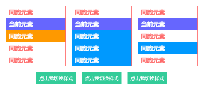
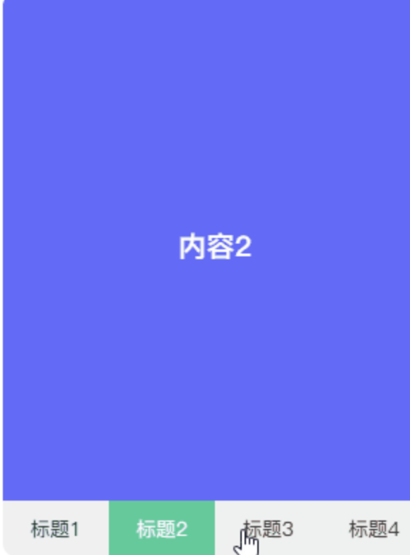
+和~
+/~都是作用于当前节点后的同胞节点,但是两者有一个明显的区别,+是针对紧随该节点的节点,而~是针对后面所有的节点,包括紧随该节点的节点。~还可针对一些特定类和选择器的节点,所以其使用性更广泛。- 另外,
+/~通常都会结合:checked完成一些高难度的纯CSS效果,当<input>触发了:checked选中状态后可通过+/~带动后面指定的节点声明一些特别属性。
通常其CSS代码形式如下。
input:checked + div {}
input:checked ~ div {}
+/~的用途很广,静态效果和动态效果都能用上它,是两个很关键的选择器。以下通过动静结合的方式展示+/~的用途。
<div class="specify-selector">
    <ul class="list">
        <li>同胞元素</li>
        <li class="next">当前元素</li>
        <li>同胞元素</li>
        <li>同胞元素</li>
        <li>同胞元素</li>
    </ul>
    <ul class="list">
        <li>同胞元素</li>
        <li class="next-all">当前元素</li>
        <li>同胞元素</li>
        <li>同胞元素</li>
        <li>同胞元素</li>
    </ul>
    <ul class="list">
        <li>同胞元素</li>
        <li class="next-filter">当前元素</li>
        <li>同胞元素</li>
        <li class="filter">同胞元素</li>
        <li>同胞元素</li>
    </ul>
</div>
<div class="specify-selector">
    <div class="button">
        <input id="btn1" type="radio" name="btns" hidden>
        <label for="btn1">点击我切换样式</label>
    </div>
    <div class="button">
        <input id="btn2" type="radio" name="btns" hidden>
        <label for="btn2">点击我切换样式</label>
    </div>
    <div class="button">
        <input id="btn3" type="radio" name="btns" hidden>
        <label for="btn3">点击我切换样式</label>
    </div>
</div>
.specify-selector {
    display: flex;
    & + .specify-selector {
        margin-top: 20px;
    }
    .list {
        border: 1px solid #f66;
        width: 200px;
        line-height: 2;
        font-weight: bold;
        font-size: 20px;
        color: #f66;
        & + .list {
            margin-left: 20px;
        }
        li {
            padding: 0 10px;
        }
        .next {
            background-color: #66f;
            color: #fff;
            & + li {
                background-color: #f90;
                color: #fff;
            }
        }
        .next-all {
            background-color: #66f;
            color: #fff;
            & ~ li {
                background-color: #09f;
                color: #fff;
            }
        }
        .next-filter {
            background-color: #66f;
            color: #fff;
            & ~ .filter {
                background-color: #09f;
                color: #fff;
            }
        }
    }
    .button {
        & + .button {
            margin-left: 20px;
        }
        label {
            display: block;
            padding: 0 10px;
            height: 40px;
            background-color: #3c9;
            cursor: pointer;
            line-height: 40px;
            font-size: 16px;
            color: #fff;
            transition: all 300ms;
        }
        input:checked + label {
            padding: 0 20px;
            border-radius: 20px;
            background-color: #f66;
        }
    }
}
:hover
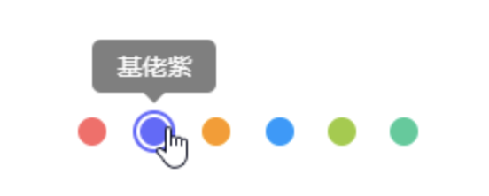
:hover作用于鼠标悬浮的节点,是一个很好用的选择器。在特定场景可代替mouseenter和mouseleave两个鼠标事件,加上transtion让节点的动画更丝滑。
结合attr()有一个很好用的场景,就是鼠标悬浮在某个节点上显示提示浮层,提示浮层里包含着该动作的文本。
- 给节点标记一个用户属性
data-* - 当鼠标悬浮在该节点上触发
:hover - 通过
attr()获取data-*的内容 - 将
data-*的内容赋值到伪元素的content上
<ul class="hover-tips">
    <li data-name="姨妈红"></li>
    <li data-name="基佬紫"></li>
    <li data-name="箩底橙"></li>
    <li data-name="姣婆蓝"></li>
    <li data-name="大粪青"></li>
    <li data-name="原谅绿"></li>
</ul>
$color-list: #f66 #66f #f90 #09f #9c3 #3c9;
.hover-tips {
    display: flex;
    justify-content: space-between;
    width: 200px;
    li {
        position: relative;
        padding: 2px;
        border: 2px solid transparent;
        border-radius: 100%;
        width: 24px;
        height: 24px;
        background-clip: content-box;
        cursor: pointer;
        transition: all 300ms;
        &::before,
        &::after {
            position: absolute;
            left: 50%;
            bottom: 100%;
            opacity: 0;
            transform: translate3d(0, -30px, 0);
            transition: all 300ms;
        }
        &::before {
            margin: 0 0 12px -35px;
            border-radius: 5px;
            width: 70px;
            height: 30px;
            background-color: rgba(#000, .5);
            line-height: 30px;
            text-align: center;
            color: #fff;
            content: attr(data-name);
        }
        &::after {
            margin-left: -6px;
            border: 6px solid transparent;
            border-top-color: rgba(#000, .5);
            width: 0;
            height: 0;
            content: "";
        }
        @each $color in $color-list {
            $index: index($color-list, $color);
            &:nth-child(#{$index}) {
                background-color: $color;
                &:hover {
                    border-color: $color;
                }
            }
        }
        &:hover {
            &::before,
            &::after {
                opacity: 1;
                transform: translate3d(0, 0, 0);
            }
        }
    }
}
:valid和:invalid
很多同学可能还会使用JS去判断表单输入内容是否合法,其实HTML5发布后,可用纯CSS完成这些工作,正确搭配一些属性能大大减少校验表单的代码量。
完成一个完整的表单验证,需以下HTML属性和选择器搭配。
placeholder:占位,在未输入内容时显示提示文本pattern:正则,在输入内容时触发正则验证:valid:作用于输入合法的表单节点:invalid:作用于输入非法的表单节点
<input type="text" placeholder="" pattern="">
input:valid {}
input:invalid {}
这个
pattern与JS正则有点不同,JS的正则形式是/regexp/,而pattern的正则形式只需/regexp/里的regexp。这个校验过程是动态触发的,监听了input这个键盘事件,当输入内容合法时触发:valid,当输入内容非法时触发:invalid。
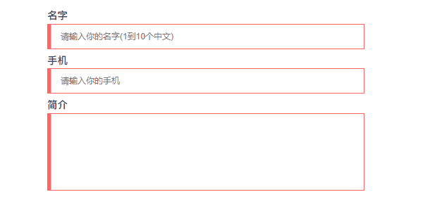
<form class="form-validation">
    <div>
        <label>名字</label>
        <input type="text" placeholder="请输入你的名字(1到10个中文)" pattern="^[\u4e00-\u9fa5]{1,10}$" required>
    </div>
    <div>
        <label>手机</label>
        <input type="text" placeholder="请输入你的手机" pattern="^1[3456789]\d{9}$" required>
    </div>
    <div>
        <label>简介</label>
        <textarea required></textarea>
    </div>
</form>
.form-validation {
    width: 500px;
    div + div {
        margin-top: 10px;
    }
    label {
        display: block;
        padding-bottom: 5px;
        font-weight: bold;
        font-size: 16px;
    }
    input,
    textarea {
        display: block;
        padding: 0 20px;
        border: 1px solid #ccc;
        width: 100%;
        height: 40px;
        outline: none;
        caret-color: #09f;
        transition: all 300ms;
        &:valid {
            border-color: #3c9;
        }
        &:invalid {
            border-color: #f66;
        }
    }
    textarea {
        height: 122px;
        resize: none;
        line-height: 30px;
        font-size: 16px;
    }
}
:checked
:checked作用于选项选中的表单节点,当<input>的type设置成radio和checkbox时可用。在CSS神操作骚技巧中是一个很重要的技巧,主要是用于模拟鼠标点击事件
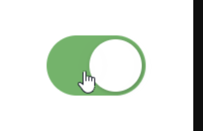
<input class="ios-switch" type="checkbox">
.btn {
    border-radius: 31px;
    width: 102px;
    height: 62px;
    background-color: #e9e9eb;
}
.ios-switch {
    position: relative;
    appearance: none;
    cursor: pointer;
    transition: all 100ms;
    @extend .btn;
    &::before {
        position: absolute;
        content: "";
        transition: all 300ms cubic-bezier(.45, 1, .4, 1);
        @extend .btn;
    }
    &::after {
        position: absolute;
        left: 4px;
        top: 4px;
        border-radius: 27px;
        width: 54px;
        height: 54px;
        background-color: #fff;
        box-shadow: 1px 1px 5px rgba(#000, .3);
        content: "";
        transition: all 300ms cubic-bezier(.4, .4, .25, 1.35);
    }
    &:checked {
        background-color: #5eb662;
        &::before {
            transform: scale(0);
        }
        &::after {
            transform: translateX(40px);
        }
    }
}
<input>与<label>的巧妙搭配
上述有提到与+/~的搭配使用,在此还有一个很重要的技巧,就是结合<label>使用。为何要结合<label>呢?因为要让input:checked + div {}或input:checked ~ div {}起效,其HTML结构必须像以下那样。
<input type="radio">
<div></div>
这样就无法分离结构与行为了,导致CSS必须跟着HTML走,只能使用绝对定位将
input>固定到指定位置。使用<label>绑定<input>,可将<input>的鼠标选择事件转移到<label>上,由<label>控制选中状态。那么HTML结构可改为以下那样,此时的<input>可设置hidden隐藏起来,不参与任何排版。
<input type="radio" id="btn" hidden>
<div>
    <label for="btn">
</div>
<input>使用id与<label>使用for关联起来,而hidden使<input>隐藏起来,不占用页面任何位置,此时<label>放置在页面任何位置都行。
input:checked + div {}
input:checked ~ div {}
笔者使用纯CSS实现的标签导航是一个很好的学习用例,在第8章变量计算有提及。
:focus-within
:focus-within作用于内部表单节点处于聚焦状态的节点。它监听当前节点里是否有表单节点,且该表单节点是否处于聚焦状态。- 有些同学听上去可能觉得拗口,其实它是一个简单易用的属性。表单控件触发
focus和blur两个鼠标事件后往祖先节点冒泡,在祖先节点上通过:focus-within捕获该冒泡事件声明样式
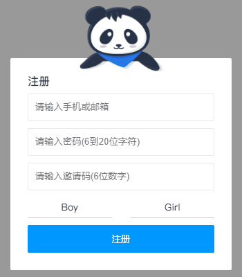
<form class="bubble-distribution">
    <h3>注册</h3>
    <div class="accout">
        <input type="text" placeholder="请输入手机或邮箱" pattern="^1[3456789]\d{9}$|^[\w-]+(\.[\w-]+)*@[\w-]+(\.[\w-]+)+$" required>
        <img src="https://b-gold-cdn.xitu.io/v3/static/img/greeting.1415c1c.png">
    </div>
    <div class="password">
        <input type="password" placeholder="请输入密码(6到20位字符)" pattern="^[\dA-Za-z_]{6,20}$" required>
        <img src="https://b-gold-cdn.xitu.io/v3/static/img/blindfold.58ce423.png">
    </div>
    <div class="code">
        <input type="text" placeholder="请输入邀请码(6位数字)" pattern="^[\d]{6}$" maxLength="6" required>
        <button type="button">查询</button>
        <img src="https://b-gold-cdn.xitu.io/v3/static/img/greeting.1415c1c.png">
    </div>
    <img src="https://b-gold-cdn.xitu.io/v3/static/img/normal.0447fe9.png">
    <ul>
        <li>
            <input id="male" type="radio" name="sex">
            <label for="male">Boy</label>
        </li>
        <li>
            <input id="female" type="radio" name="sex">
            <label for="female">Girl</label>
        </li>
    </ul>
    <button type="button">注册</button>
</form>
.bubble-distribution {
    position: relative;
    margin-top: 50px;
    padding: 25px;
    border-radius: 2px;
    width: 320px;
    background-color: #fff;
    h3 {
        font-size: 16px;
        color: #333;
    }
    div {
        margin-top: 10px;
    }
    img {
        position: absolute;
        left: 50%;
        bottom: 100%;
        margin: 0 0 -20px -60px;
        width: 120px;
    }
    ul {
        display: flex;
        justify-content: space-between;
        align-items: center;
        margin-top: 10px;
        height: 30px;
        line-height: 30px;
    }
    li {
        position: relative;
        width: 45%;
        transition: all 300ms;
        &:focus-within {
            background: linear-gradient(90deg, #09f 50%, transparent 0) repeat-x,
                linear-gradient(90deg, #09f 50%, transparent 0) repeat-x,
                linear-gradient(0deg, #09f 50%, transparent 0) repeat-y,
                linear-gradient(0deg, #09f 50%, transparent 0) repeat-y;
            background-position: 0 0, 0 100%, 0 0, 100% 0;
            background-size: 8px 1px, 8px 1px, 1px 8px, 1px 8px;
            animation: move 500ms infinite linear;
        }
    }
    input[type=text],
    input[type=password] {
        padding: 10px;
        border: 1px solid #e9e9e9;
        border-radius: 2px;
        width: 100%;
        height: 40px;
        outline: none;
        transition: all 300ms;
        &:focus:valid {
            border-color: #09f;
        }
        &:focus:invalid {
            border-color: #f66;
        }
    }
    input[type=radio] {
        position: absolute;
        width: 0;
        height: 0;
        &:checked + label {
            border: 3px solid transparent;
            background-color: #09f;
            color: #fff;
        }
    }
    label {
        display: block;
        border-bottom: 1px solid #ccc;
        width: 100%;
        background-clip: padding-box;
        cursor: pointer;
        text-align: center;
        transition: all 300ms;
    }
    button {
        overflow: hidden;
        margin-top: 10px;
        border: none;
        border-radius: 2px;
        width: 100%;
        height: 40px;
        outline: none;
        background-color: #09f;
        cursor: pointer;
        color: #fff;
        transition: all 300ms;
    }
    .accout,
    .password,
    .code {
        img {
            display: none;
            margin-bottom: -27px;
        }
        &:focus-within {
            img {
                display: block;
            }
            & ~ img {
                display: none;
            }
        }
    }
    .code {
        display: flex;
        justify-content: space-between;
        button {
            margin-top: 0;
        }
        input {
            &:not(:placeholder-shown) {
                width: 70%;
                & + button {
                    width: 25%;
                }
            }
            &:placeholder-shown {
                width: 100%;
                & + button {
                    width: 0;
                    opacity: 0;
                }
            }
        }
    }
}
@keyframes move {
    to {
        background-position: 6% 0, -6% 100%, 0 -6%, 100% 6%;
    }
}
:empty
还有使用JS判断列表集合为空时显示占位符吗?相信很多使用MVVM框架开发的同学都会使用条件判断的方式渲染虚拟DOM,若列表长度不为0则渲染列表,否则渲染占位符。然而CSS提供了一个空判断的选择器
:empty,这应该很少同学会注意到。
:empty作用于无子节点的节点,这个子节点也包括行内匿名盒(单独的文本内容),匿名盒在第4章盒模型有提及。以下三种情况均为非空状态,若不出现这三种状态则为空状态,此时:empty才会触发。
- 仅存在节点:
<div><p>CSS</p></div> - 仅存在文本:
<div>CSS</div> - 同时存在节点和文本:
<div>Hello <p>CSS</p></div>
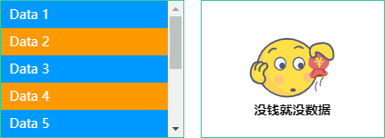
<ul class="empty-list">
    <li v-for="v in 10" :key="v">Data {{v}}</li>
</ul>
<ul class="empty-list"></ul>
$empty: "https://yangzw.vip/img/empty.svg";
.empty-list {
    overflow: auto;
    width: 200px;
    height: 150px;
    outline: 1px solid #3c9;
    &:empty {
        display: flex;
        justify-content: center;
        align-items: center;
        background: url($empty) no-repeat center/100px auto;
        &::after {
            margin-top: 90px;
            font-weight: bold;
            content: "没钱就没数据";
        }
    }
    & + .empty-list {
        margin-left: 20px;
    }
    li {
        padding: 0 10px;
        height: 30px;
        background-color: #09f;
        line-height: 30px;
        color: #fff;
        &:nth-child(even) {
            background-color: #f90;
        }
    }
}
::before和::after
- 有时为了实现某个效果而往页面里反复添加标签变得很繁琐,添加太多标签反而不好处理而变得难以维护。此时会引入伪元素这个概念解决上述问题。
- 伪元素指页面里不存在的元素。伪元素在HTML代码里未声明,却能正常显示,在页面渲染时看到这些本来不存在的元素发挥着重要作用。
:before和:after是两个很重要的伪元素,早在CSS2就出现了。
起初伪元素的前缀使用单冒号语法。随着CSS改革,伪元素的前缀被修改成双冒号语法,
:before/:after从此变成::before/::after,用来区分伪类。若兼容低版本浏览器,还需使用:before和:after,但是本小册均以::before/::after编写CSS代码。
伪元素和伪类虽然都是选择器,但是它们还是存在一丝丝的差别。
- 伪元素通常是一些实体选择器,选择满足指定条件的DOM,例如
::selection、:nth-child(n)和:first-child - 伪类通常是一些状态选择器,选择处于特定状态的DOM,例如:
hover、:focus和:checked ::before/::after必须结合content使用,通常用作修饰节点,为节点- 插入一些多余的东西,但又不想内嵌一些其他标签。若插入2个以下(包含2个)的修饰,建议使用::before/::after。
以下两个HTML结构是等效的
<p>
    <span>:before</span>
    CSS
    <span>:after</span>
</p>
<p>CSS</p>
// 接上一个HTML结构
p {
    &::before {
        content: ":before";
    }
    &::after {
        content: ":after";
    }
}
::before/::after最常用的场景就是气泡对话框,圆滚滚的身子带上一个三角形的尾巴。像以下第二个挖空的气泡对话框,其实使用白色填充背景颜色,而小尾巴使用白色的::after叠加橙色的::before形成障眼法。
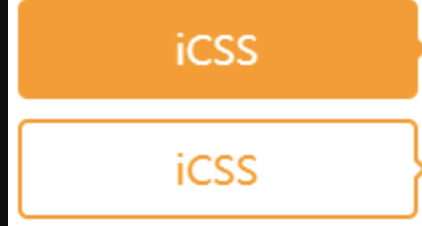
<div class="bubble-box">iCSS</div>
<div class="bubble-empty-box">iCSS</div>
.bubble-box {
    position: relative;
    border-radius: 5px;
    width: 200px;
    height: 50px;
    background-color: #f90;
    line-height: 50px;
    text-align: center;
    font-size: 20px;
    color: #fff;
    &::after {
        position: absolute;
        left: 100%;
        top: 50%;
        margin-top: -5px;
        border: 5px solid transparent;
        border-left-color: #f90;
        content: "";
    }
}
.bubble-empty-box {
    position: relative;
    margin-top: 10px;
    border: 2px solid #f90;
    border-radius: 5px;
    width: 200px;
    height: 50px;
    line-height: 46px;
    text-align: center;
    font-size: 20px;
    color: #f90;
    &::before {
        position: absolute;
        left: 100%;
        top: 50%;
        margin: -5px 0 0 2px;
        border: 5px solid transparent;
        border-left-color: #f90;
        content: "";
    }
    &::after {
        position: absolute;
        left: 100%;
        top: 50%;
        margin-top: -4px;
        border: 4px solid transparent;
        border-left-color: #fff;
        content: "";
    }
}


